


开发 | 想让你的小程序更好用?不如试试为它「加特技」
文 | OkayChen
写在前面
最近在负责一个微信小程序的前端以及前后端接口的对接的项目,整体上所有页面的布局我都已经搭建完成。
在小程序中,有一些常用的特效。在这里就为总结一下,希望对大家和我都能有所帮助。
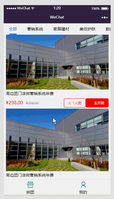
1. 滚动 Tab 选项卡
先看一下效果图吧,能够点击菜单或滑动页面切换,tab 菜单部分可以实现左右滚动
好了,看一下实现方法吧。
首先是 WXML 代码:
<!-- tab header -->
<scroll-view scroll-x="true" class="tab-h" scroll-left="{{scrollLeft}}">
  <view class="tab-item {{currentTab==0?'active':''}}" data-current="0" bindtap="swichNav">全部</view>
  <view class="tab-item {{currentTab==1?'active':''}}" data-current="1" bindtap="swichNav">营销系统</view>
  <view class="tab-item {{currentTab==2?'active':''}}" data-current="2" bindtap="swichNav">家居建材</view>
  <view class="tab-item {{currentTab==3?'active':''}}" data-current="3" bindtap="swichNav">美妆护肤</view>
  <view class="tab-item {{currentTab==4?'active':''}}" data-current="4" bindtap="swichNav">数码电器</view>
  <view class="tab-item {{currentTab==5?'active':''}}" data-current="5" bindtap="swichNav">母婴玩具</view>
  <view class="tab-item {{currentTab==6?'active':''}}" data-current="6" bindtap="swichNav">零元购活动</view>
</scroll-view>

<!-- tab content -->
<swiper class="tab-content" current="{{currentTab}}" duration="300" bindchange="switchTab" style="max-height:{{winHeight}}rpx">
  <swiper-item wx:for="{{[0,1,2,3,4,5,6]}}">
    <scroll-view scroll-y="true" class="scoll-h">
      <block wx:for="{{[1,2,3,4,5,6,7]}}" wx:key="*this">
        <view class='goods-Wrapper'>
          <image mode='widthFix' class="goods-img" src='../../image/goods1.jpg'></image>
          <view class="goods-info">
            <view>周边团门店微营销系统年费</view>
            <view>
              <text class='price'>¥298.00</text>
              <text class='line-delete'>
                ¥298.00
              </text>
              <label>
                <button><image mode='widthFix' src='../../image/icon1.png'></image>1人团</button>
                <button><image mode='widthFix' src='../../image/icon2.png'></image>去开团</button>
              </label>
            </view>
          </view>
        </view>
      </block>
    </scroll-view>
  </swiper-item>
</swiper>
在 WXSS 代码中,这里只展示 tab 菜单处的样式代码。
.tab-h {
  height: 80rpx;
  width: 100%;
  box-sizing: border-box;
  overflow: hidden;
  line-height: 80rpx;
  background: #f7f7f7;
  font-size: 14px;
  white-space: nowrap;
  position: fixed;
  top: 0;
  left: 0;
  z-index: 99;
}

.tab-item {
  margin: 0 36rpx;
  display: inline-block;
}

.tab-item.active {
  color: #4675f9;
  position: relative;
}

.tab-h .tab-item.active:after {
  content: "";
  display: block;
  height: 8rpx;
  width: 115rpx;
  background: #4675f9;
  position: absolute;
  bottom: 0;
  left: 5rpx;
  border-radius: 16rpx;
}

.tab-h .tab-item:nth-child(1).active:after {
  width: 52rpx;
}
JS 代码如下:
var app = getApp();
Page({
  data: {
    winHeight: "",//窗口高度
    currentTab: 0, //预设当前项的值
    scrollLeft: 0, //tab标题的滚动条位置
    expertList: [{ //假数据
      img: "",
      name: "",
      tag: "",
      answer: 134,
      listen: 2234
    }]
  },
  // 滚动切换标签样式
  switchTab: function (e) {
    this.setData({
      currentTab: e.detail.current
    });
    this.checkCor();
  },
  // 点击标题切换当前页时改变样式
  swichNav: function (e) {
    var cur = e.target.dataset.current;
    if (this.data.currentTaB == cur) { return false; }
    else {
      this.setData({
        currentTab: cur
      })
    }
  },
  //判断当前滚动超过一屏时,设置tab标题滚动条。
  checkCor: function () {
    if (this.data.currentTab > 4) {
      this.setData({
        scrollLeft: 300
      })
    } else {
      this.setData({
        scrollLeft: 0
      })
    }
  },
  onLoad: function () {
    var that = this;
    //  高度自适应
    wx.getSystemInfo({
      success: function (res) {
        var clientHeight = res.windowHeight,
          clientWidth = res.windowWidth,
          rpxR = 750 / clientWidth;
        var calc = clientHeight * rpxR - 180;
        console.log(calc)
        that.setData({
          winHeight: calc
        });
      }
    });
  },
  footerTap: app.footerTap
})
2. 星级评分
按照惯例,先上效果图。
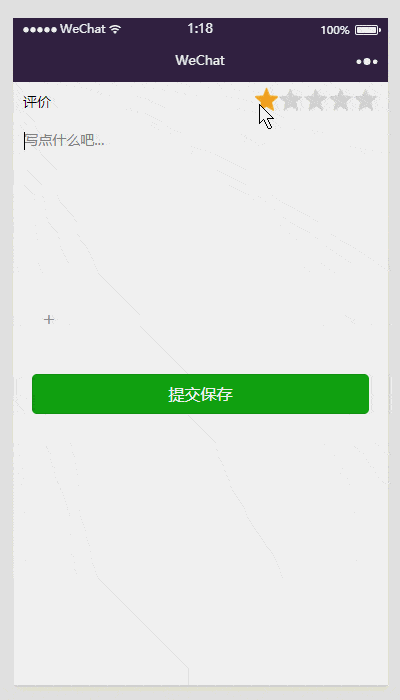
在实例中,默认一星,点击可以选择星级,可半星显示。
来看看代码。首先是 WXML:
<view class='accessWrapper'>
  <view class='title'>
    评价
    <view class='starsWrapper'>
      <block wx:for="{{stars}}">
        <image class="star-image" style="left: {{item*50}}rpx" src="{{key > item ?(key-item == 0.5?halfSrc:selectedSrc) : normalSrc}}">
          <view class="item" style="left:0rpx" data-key="{{item+0.5}}" bindtap="selectLeft"></view>
          <view class="item" style="left:25rpx" data-key="{{item+1}}" bindtap="selectRight"></view>
        </image>
      </block>
    </view>
  </view>

<!-- 这里绑定是bindInput而不是bindtab -->
<textarea bindinput='textAreaCon' placeholder='写点什么吧...' auto-focus='true'></textarea>
<view class='uploadFile' bindtap='upload'>+</view>
</view>

<button type='submit' bindtap='saveAccess' class='save-edit'>提交保存</button>
然后是 WXSS 样式。
page{
  background: #f5f5f5;
}

.accessWrapper{
  background: #fff;
  font-size: 14px;
  padding-bottom: 10px;
}

.accessWrapper textarea{
  width: 94%;
  margin: 0 auto;
  max-height: 200px;
  border-top: 1px solid #f5f5f5;
  padding: 10px 0px;
}

.accessWrapper textarea::-webkit-scrollbar{
  width: 0px;
  height: 0px;
  color: transparent;
}

.accessWrapper .title{
  padding: 10px;
}
.starsWrapper{
  position: absolute;
  top: -20px;
  right: 135px;
}
/* stars */
.star-image {
  position: absolute;
  top: 50rpx;
  width: 50rpx;
  height: 50rpx;
  src: "../../../image/normal.png";
}

.item {
  position: absolute;
  top: 0rpx;
  width: 50rpx;
  height: 50rpx;
}

.uploadFile{
  width: 50px;
  height: 50px;
  border: 1px solid #f5f5f5;
  color: #999;
  text-align: center;
  line-height: 50px;
  font-size: 20px;
  margin-left: 10px;
}
JS 代码:
var app = getApp()
Page({
  data: {
    stars: [0, 1, 2, 3, 4],
    normalSrc: '../../../image/normal.png',
    selectedSrc: '../../../image/selected.png',
    halfSrc: '../../../image/half.png',
    key: 1,//评分
    path: ' ',
    userInput:' '
  },
  onLoad: function () {

  },

  //点击右边,半颗星
  selectLeft: function (e) {
    var key = e.currentTarget.dataset.key
    if (this.data.key == 0.5 && e.currentTarget.dataset.key == 0.5) {
      //只有一颗星的时候,再次点击,变为0颗
      key = 0;
    }
    console.log("得" + key + "分")
    this.setData({
      key: key
    })
  },
  //点击左边,整颗星
  selectRight: function (e) {
    var key = e.currentTarget.dataset.key
    console.log("得" + key + "分")
    this.setData({
      key: key
    })
  },

   upload: function () {
    var that = this
    wx.chooseImage({
      count: 1,
      sizeType: ['original', 'compressed'],
      sourceType: ['album', 'camera'],
      success: function (res) {
        var tempFilePaths = res.tempFilePaths
        console.log(tempFilePaths)
        wx.uploadFile({
          url: 'http://example.weixin.qq.com/upload',
          filePath: tempFilePaths[0],
          name: 'file',
          formData: {
            'user': 'test'
          },
          success: function (res) {
            var data = res.data
            wx.showModal({
              title: '上传文件返回状态',
              content: '成功',
              success: function (res) {
                if (res.confirm) {
                  console.log('用户点击确定')
                }
              }
            })//do something
          },
          fail: function (res) {
            console.log(res)
          }
        })
        that.setData({
          path: tempFilePaths
        })
      }
    })
  },

   textAreaCon:function(e){
     var that = this;
     that.setData({
       userInput: e.detail.value,
     })
   },
   saveAccess:function(e){
     if(this.data.userInput == ' '){
       wx.showModal({
         title: '提示',
         content: '对不起,请输入留言内容',
       })
     }else{
      console.log(this.data.userInput);
      //  成功监听用户输入内容
     }
   }
})
3. 自定义底部弹出层
自定义底部弹出层,在电商的小程序中经常会用到,需要根据实际需求,自定义弹出内容。
先看下我的效果:

在这里的示例代码中,我已经把我自定义的部分抽离了出来。
照例,先是 WXML 代码:
<view class='yourPurse' bindtap='showModal1'></view>
<view class="commodity_screen" bindtap="hideModal" wx:if="{{showModalStatus}}"></view>
<view animation="{{animationData}}" class="commodity_attr_box" wx:if="{{showModalStatus}}"></view>
接下来是样式 WXSS:
.commodity_screen {
  width: 100%;
  height: 100%;
  position: fixed;
  top: 0;
  left: 0;
  background: #000;
  opacity: 0.2;
  overflow: hidden;
  z-index: 1000;
  color: #fff;
}

.commodity_attr_box {
  width: 100%;
  overflow: hidden;
  position: fixed;
  bottom: 0;
  left: 0;
  z-index: 2000;
  background: #fff;
  padding-top: 20rpx;
}
JS 代码如下:
showModal: function () {
  // 显示遮罩层
  var animation = wx.createAnimation({
    duration: 200,
    timingFunction: "linear",
    delay: 0
  })
  this.animation = animation
  animation.translateY(300).step()
  this.setData({
    animationData: animation.export(),
    showModalStatus: true
  })
  setTimeout(function () {
    animation.translateY(0).step()
    this.setData({
      animationData: animation.export()
    })
  }.bind(this), 200)
},
hideModal: function () {
  // 隐藏遮罩层
  var animation = wx.createAnimation({
    duration: 200,
    timingFunction: "linear",
    delay: 0
  })
  this.animation = animation
  animation.translateY(300).step()
  this.setData({
    animationData: animation.export(),
  })
  setTimeout(function () {
    animation.translateY(0).step()
    this.setData({
      animationData: animation.export(),
      showModalStatus: false
    })
  }.bind(this), 200)
}
写在后面
这次没有知识点讲解,是我正在做的小程序项目中我做的一些小实例的源码,总结下来了三个非常常用的。如果喜欢,或者对你有帮助,欢迎 copy 和学习。
另外,这个项目最近在 GitHub 上持续更新。
关注「知晓程序」微信公众号,回复「源码」,获取本项目源码更新。
欢迎大家 star、在留言区中留下你的建议。
关注「知晓程序」公众号 👇
- 在微信后台回复「开发」,获取小程序开发。
- 在微信后台回复「定制」,做一个属于你的小程序。

正在加载中


